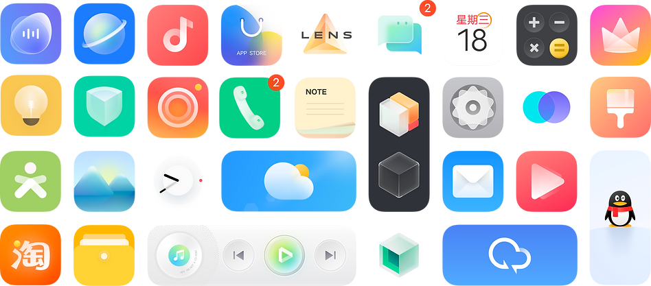
DESKTOP VISUAL SYSTEM
+
ROLE
Researcher
TEAM
Desktop Design Center
(Yuzhong, Liu liu, Liu Weng, Shenming, Luna Lu)
DATE
2020
(6 Month)
Wireframe
UX Designer
OVERVIEW
An OS for everyone—Origin os
In May 2020, vivo announced its intention to introduce an all-new operating system known as Origin OS, intended to supersede the existing Funtouch OS.
vivo's mobile phone product line consists of 6 distinct series, each featuring its unique desktop visual interface built upon various iterations of the Funtouch OS.
We aim to devise a resolution to consolidate the disparate interfaces of the six preceding series into an innovative desktop visual system that will serve as vivo's new operating system for all mobile devices, hereby christened as OriginOS.
Project
Map
Overview
Design concept
Brand a new OS
“Origin OS”
Timeline Design
Project
Result
2x2 Styles
432 icons
Into the detail
Design Language
Creating distinct and unique icons
Sense of space
Soft UI + Flat UI
What's More
Expand the capabilities of icons
User Feedback
“Most flexible mobile desktop experience”
Project
SUMMARY
"Most impactful projects!"

Shaping OriginOS: A Key Role in UX Design and Innovation
As a UX Designer, my responsibilities included enhancing user interface aesthetics, driving adoption, and developing distinctive features to set OriginOS apart in a competitive market.
Strategic User Research
Conducted in-depth user research to understand user needs and preferences, directly inform design specifications
Data-Driven Design
Utilized user feedback and data analytics to develop design features that differentiate OriginOS in a saturated market
Cross-functional Collaboration
Worked closely with product managers and developers to translate design excellence into commercial success
DESIGN CONCEPT
Timeline Design
Our goal is to design a smartphone operating system that appeals to a diverse range of people, with "Beauty for Everyone" at its core. We understand beauty as a personal and emotional experience, beyond just physical appearance.
To achieve this, we studied the relationship between humans and nature and looked at how natural elements shape people's perceptions of beauty. Our research showed us that beauty comes from the complete experience, with time playing an important part in it. This led us to develop a design philosophy called "Timeline Design", which focuses on capturing the beauty of time and delivering it to users.
Thematic
Elements
The static, scene-associated elements serve as the source of the graphics.
Relationship
Timeline
Design
Passage
of Time
Human & Nature
The transformation of the scene over time, showcasing the flow of time in the design.
Dialogue
Form
The manner in which the scene communicates with users, even in its subtlest dynamics.
"Timeline Design" is a philosophy that seeks to capture and present the beauty of time to users. This design approach changes the user experience by focusing on 3 key elements. By highlighting these three aspects, Timeline Design creates an immersive and beautiful user experience that resonates with emotions and captures the essence of beauty for everyone.
01 Thematic Elements
The static, scene-associated elements serve as the source of the graphics.

Camera

Files

Secure

Browser

Settings

i Music

Tips

Wallet

Calculator
02 Passage of Time
By capturing the beauty of time's flow, we aim to create a dynamic and captivating user experience. The transformation of the scene over time highlights the passing of time and adds depth and character to the design. Our goal is to showcase this change in a way that resonates with users and adds to their overall perception of beauty.

The Four Seasons Album
Scenery From Guilin, China

Spring

Summer

Autumn

Winter

Weather

Sun

Overcast

Rain

Snow
Our design captures the evolution of beauty over time, allowing users to experience its dynamic nature. The Four Seasons Album and Weather are prime examples of how we bring this concept to life, showcasing the changes of the seasons and their impact on the natural world and human emotions.
03 Dialogue Form
These subtle design elements in our design, such as the rolling corner of a sticky note, cute eyes on a text message, and dynamic color changes in the console, add an extra layer of interactivity to the user experience. By bringing these interactive elements to life, we aim to create an emotional connection between the user and the scene, making the overall experience more immersive and memorable.

"Sticky note rolls up if frequently used."
"Adorable eye icon signals new text message."
"Color-changing mode icons in the console indicating Eco, Performance, or Monster modes."
DESIGN LANGUAGE
Sense Of Space
We further developed our design philosophy to develop OriginOS's desktop visual system. We delved into the concept of space, broadening our perspective beyond just the three-dimensional sense of single objects to encompass the hierarchy of the entire spatial scene. This expanded understanding was distilled into five key dimensions: light and shadow, structure, color, Texture, and graphics, which together, reflect the sense of space.
Light & Shadow
Structure
Sence
Of
Space
Color
Texture
Graphics
Our design language is composed of two distinct styles, the Soft UI and the Flat UI, each of which is created by combining different expressions of the five dimensions of space. This offers users a choice between two unique and visually compelling options.

SOFT UI STYLE
The Soft UI style offers a Skeuomorphism approach, with a focus on lightness and transparency to express the sense of space.

Soft
Light & Shadow

Soft & Friendly feel
Texture

Interspersed
Structure

Broadly Applied
Graphics
Gradient
Colors


FLAT UI STYLE
The Flat UI Style uses simplicity to express the sense of space, delivering stronger visual messages compared to the Soft UI Style, which focuses on lightness and transparency.

Streamlined
Light & Shadow

Weakened
Texture

Interspersion & Metaphor
Structure

Sense of order
Graphics
Bright
Colors

INTO THE DETAIL
Each icon should have its own personality, making it come alive.
Following our exploration of concepts and design language, we delved into the finer details of each icon. We highlighted the unique traits and moods of each one, solidified our understanding, and ultimately strengthened the overall mental construction of the desktop visual system.


PROJECT RESULT
Brand new OS. Brand new desktop visual system.
OriginOS desktop visual system was a long-term large-scale project that brought together a multi-post team to create a 1.0 desktop visual system from the ground up.
I played a significant role in the design of the 432 icons in the project, leading the design of 186 icons and contributing to the design of the rest. I was also the lead designer for the Flat UI style icons.
SOFT UI STYLE
Rectangle

Openicon


FLAT UI STYLE
LEAD BY ME
Rectangle

Openicon

Origin OS Mood Cube


The biggest difference the Mood Cube OS brings to the smartphone is "real-time" versus "real." The developers have innovated on the personalization of the smartphone while accounting for all usage styles and habits. The user can change the wallpaper to create a more intuitive connection with the real world. They can also define a set of personalized icons based on their preferences and even switch between two different personality worlds.
WHAT'S MORE...
More Size
We didn't limit ourselves to just 1x1 icons. Instead, we expanded our options by exploring the potential of various icon sizes, providing users with a multitude of choices.
Fusion icon
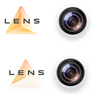
The fusion icon concept allows strongly related icons to come together and form a combined 1x2 icon, either horizontally or vertically. This is accompanied by an auditive "click" sound effect during the fusion process.
For instance, a camera and lens kit can be merged into one fusion icon, as can deformers and interactive pools in the desktop settings.
Lens Kit
Camera
Deformers
Interaction Pool

Multi- Size icons
Every icon is available in four dimensions: 1X1, 1X2, 2X1, and 2X2. Alongside the size variations, the content of the icons undergoes specific transformations in form.

More Icons
"We elevated the user experience to a whole new level by not only redesigning the system icons but also by redrawing over 200 third-party icons to align with our visual system, resulting in a cohesive and enjoyable desktop icon system."

USER FEEDBACK
The Ultimate Customizable Mobile Desktop
The launch of the system was met with overwhelmingly positive feedback from users, who expressed their excitement for discovering and customizing their own desktops. This resulted in many users sharing their personalized versions with us.
Screenshot from users

PROJECT IMPACT
Result and Impact


Commercial Success
The launch of OriginOS significantly impacted vivo's market position, with a 40% increase in user adoption rates within the first six months post-launch, directly contributing to an increase in market share.
Leadership and Growth
The project improved my strategic design skills and showcased my ability to lead cross-functional teams to drive projects aligning UX with business goals.
Impact on Business Goals
Improved user interface design resulted in a 50% decrease in customer churn and a 35% increase in customer satisfaction scores, directly contributing to boosted customer loyalty and brand strength.
Recognized Industry Innovation
Received an iF Design Award, highlighting not just the creative excellence but also the market relevance of OriginOS.
PROJECT SUMMARY
The most influential projects
I have achieved significant advancement in this project and have detailed my key contributions below.
-
Defined Design Process: The design process was defined to provide a clear direction for the project.
-
Established Design Philosophy: The design philosophy was established based on keywords discovered during the idea launch process.
-
Led Flat UI Style Design: The design language of the Flat UI style was summarized based on a sense of space and the design process was led and managed.
-
Participation in Icon Design: A total of 432 icons were designed, with 186 icons led by the team, and all icons participated.
-
Coordinated Design Output: The team's output was coordinated and collected to finalize the design outcomes.
-
Implementation Coordination: The project involved a huge design content and required coordination between the team and motion engineers and software engineers to implement the design and integrate it into mobile devices (1320 cut pictures completed for developers).
-
Marketing Point of Contact: After the project was completed, the team acted as the point of contact with the marketing team to promote the design system.
-
Positive Influence on Team Dynamics: The team, including the youngest and only female member, brought happiness and energy to the team and faced difficulties and challenges together.


vivo Special Event 11/28 2020 Shenzhen

I am thankful to Yu Zhong, Liu Liu, Wen Liu, and Ming Shen for their unwavering support during my onboarding process. Their high standards and guidance helped me grow and take on more responsibilities.
